Wysiwyg example
How it works
One wrapper class styles whatever a rich text editor saved. No BEM classes on the inside.
A content component (c--content-*) styles the raw HTML that comes out of a rich text editor: headings, paragraphs, links, lists, quotes and images, exactly as the CMS serialised them. All the styling hangs off one wrapper class; the elements inside carry no classes of ours, because an editor cannot add them. Everything on this page is driven by the @terrahq/wysiwyg package, which ships the mixins and knows the markup of each CMS.
<!-- One wrapper. Everything inside is what the editor saved, with no classes of ours -->
<div class="c--content-a">
  <h2>Title</h2>
  <p>Paragraph with <strong>bold</strong>, <em>italic</em> and <a href="#">a link</a>.</p>
  <ul>
    <li>Item</li>
  </ul>
</div>
Sanity or WordPress
The package has one entry per CMS, and the import decides which markup is expected. @terrahq/wysiwyg/sanity styles the clean HTML of Portable Text: plain blockquote with text inside, figure with an optional size class, lists without classes. @terrahq/wysiwyg/wordpress knows the Gutenberg output too (wp-block-* classes, buttons, columns, tables, separators, cite in quotes). This project imports the Sanity flavour; the maps a flavour does not support throw a Sass error, so a wrong import fails at build time, not in the browser.
The two mixins
make-content() lays the groundwork once: it resets the lists and draws the bullets and the counters, sizes the figures, makes em italic, and removes the top padding of the first child and the bottom margin of the last one so the block sits flush in its column. make-content-modifier() is where the look comes from: it takes one option map per family of elements and only writes the properties you set. Calling it again inside a modifier (&--second, for a dark background) overrides just the keys that change.
The option maps
Every map is a Sass map. Spacing and colours are plain values ($measure * 4, map.get($color-options, a)), and type is set through "className": a space-separated list of foundation classes (f--font-e f--color-a) that the mixin applies with @extend. That keeps the content component on the same type scale as the rest of the site, with nothing in the markup. The font keys (className, margin-bottom, padding-top, font-weight, bold-font-weight…) are the same wherever text is styled: a heading, a paragraph, a caption, the numbers of a list.
Where it lives
The component is src/scss/framework/components/content/_c--content-a.scss, registered in src/scss/style.scss like any other component. It is also the block that wraps the prose of every page of these docs, so the file below is the one you are reading with.
//* content
@use "@scss/framework/components/content/_c--content-a.scss";
@use "@terrahq/wysiwyg/sanity" as *;
@use "sass:color";
@use "sass:map";
@use "@scss/framework/_vars/_vars.scss" as *;
@use "@scss/framework/utilities/utilities.scss" as *;
@use "@scss/framework/foundation/foundation.scss" as *;
.c--content-a{
@include make-content();
@include make-content-modifier(
//* headings
$headings-options: (
    "h2": (
        "className": f--font-a f--color-a,
        "margin-bottom": $measure * 4,
        "padding-top": $measure * 13,
    ),
    "h3": (
        "className": f--font-d f--color-a,
        "margin-bottom": $measure * 2,
        "padding-top": $measure * 5,
    ),
    "h4": (
        "className": f--font-e f--color-a,
        "font-weight": 700,
        "margin-bottom": $measure,
        "padding-top": $measure * 3,
    ),
    "h5": (
        "className": f--font-e f--color-a,
        "font-weight": 600,
        "margin-bottom": $measure,
        "padding-top": $measure * 2,
    ),
    "h6": (
        "className": f--font-f f--color-a,
        "font-weight": 600,
        "letter-spacing": 0.04em,
        "margin-bottom": $measure,
        "padding-top": $measure * 2,
    ),
),
//* paragraphs
$paragraphs-options: (
"className": f--font-e f--color-a,
"margin-bottom": $measure * 2,
"bold-font-weight": 500,
),
//* links
$link-options: (
"className": f--color-e,
),
//* lists
$lists-options: (
"first-level-artwork-width": 6px,
"first-level-artwork-top": 10px,
"first-level-artwork-background": map.get($color-options, a),
"first-level-artwork-border-radius": 50%,
"first-level-artwork-border-width": 0,
"first-level-artwork-border-color": map.get($color-options, a),
"first-number-width": 1rem,
"first-level-number-color": map.get($color-options, a),
"number-font": (
"className": f--font-e,
),
"margin-bottom": $measure * 3,
"nested-list-spacing": $measure,
"font-styles": (
"className": f--font-e f--color-a,
"margin-bottom": $measure,
),
),
//* images
$image-options: (
"border-radius": $measure,
"margin-bottom": $measure * 4,
"caption": (
"className": f--font-f f--color-a,
"padding-top": $measure,
"text-align": center,
),
),
//* quotes
$quote-options: (
"padding": $measure * 2 $measure * 3,
"margin-top": $measure * 3,
"margin-bottom": $measure * 4,
"border": (
"border-color": map.get($color-options, e),
"border-style": solid,
"border-width": 0 0 0 3px,
),
),
//* custom
$custom-options: (
"blockquote": (
"class": (f--font-d, f--color-a),
"font-style": italic,
),
"a:not([class])": (
"text-decoration": underline,
"text-underline-offset": 0.15em,
),
),
);
margin-bottom: $measure * 8;
}Headings
One entry per level in $headings-options; levels you leave out keep the browser default.
h2h3h4h5h6 The map has one key per level, "h1" to "h6", and each takes the font keys. In Sanity the rule targets the direct children of the wrapper (& > h2), so a heading nested in another block is left alone. Here h2 is the page title size (f--font-a) with a tall padding-top to separate the sections of an article, h3 is f--font-d, and h4 to h6 stay on the paragraph scale and differ by weight. h1 is not set: a content block never holds the page title.
$headings-options: (
"h2": (
"className": f--font-a f--color-a,
"margin-bottom": $measure * 4,
"padding-top": $measure * 13,
),
"h3": (
"className": f--font-d f--color-a,
"margin-bottom": $measure * 2,
"padding-top": $measure * 5,
),
"h4": (
"className": f--font-e f--color-a,
"font-weight": 700,
"margin-bottom": $measure,
"padding-top": $measure * 3,
),
"h5": (
"className": f--font-e f--color-a,
"font-weight": 600,
"margin-bottom": $measure,
"padding-top": $measure * 2,
),
"h6": (
"className": f--font-f f--color-a,
"font-weight": 600,
"letter-spacing": 0.04em,
"margin-bottom": $measure,
"padding-top": $measure * 2,
),
),The live examples on this page use the Sanity test content that ships with the package, lorem ipsum included: it is the fixture the mixins are tested against, so every element the package knows is covered.
<h2>Sanity content test</h2>
<h3>Headings</h3>
<h4>heading h4</h4>
<h5>heading h5</h5>
<h6>heading h6</h6>h2h3h4h5h6 Sanity content test
Headings
heading h4
heading h5
heading h6
Paragraphs
$paragraphs-options for the text, $link-options for the links inside it. Bold and italic come for free.
classNamemargin-bottombold-font-weight$link-options $paragraphs-options is one font map applied to the direct p children of the wrapper. "className" sets the type and colour, "margin-bottom" the rhythm between paragraphs, and "bold-font-weight" the weight of strong and b inside them (the test content has a bold run and an italic-and-bold one). em is italic from make-content(); nothing to set.
$paragraphs-options: (
    "className": f--font-e f--color-a,
    "margin-bottom": $measure * 2,
    "bold-font-weight": 500,
),
Links
$link-options has a single key, "className", applied to every a without a class. In a project with a link component you pass it here (c--link-a) and import its file at the top; this framework has none, so the colour comes from a foundation class and the underline from $custom-options further down. Sanity wraps the link in a span, which the selector does not mind.
$link-options: (
    "className": f--color-e,
),<p>
ipsum dolor sit amet const
<span><a href="#" rel="nofollow noopener">this is a link</a></span>
const lorem ipsum dolor <strong>this is bold</strong> dolor sit amet const lorem
ipsum dolor sit amet const lorem ipsum <em>this is italic</em> lorem ipsum dolor sit
amet const lorem ipsum dolor sit amet const lorem ipsum
<em><strong>this is italic and bold</strong></em>
</p>
<p>
ipsum dolor sit amet const lorem ipsum dolor sit amet const lorem ipsum dolor sit
amet const lorem ipsum dolor sit amet const lorem ipsum dolor sit amet const lorem
ipsum dolor sit amet const lorem ipsum dolor sit amet const
</p>classNamemargin-bottombold-font-weight$link-options ipsum dolor sit amet const this is a link const lorem ipsum dolor this is bold dolor sit amet const lorem ipsum dolor sit amet const lorem ipsum this is italic lorem ipsum dolor sit amet const lorem ipsum dolor sit amet const lorem ipsum this is italic and bold
ipsum dolor sit amet const lorem ipsum dolor sit amet const lorem ipsum dolor sit amet const lorem ipsum dolor sit amet const lorem ipsum dolor sit amet const lorem ipsum dolor sit amet const lorem ipsum dolor sit amet const
Lists
Bullets and counters drawn by the package, sized and coloured by $lists-options.
first-level-artwork-*first-number-widthnumber-fontfont-stylesnested-list-spacing make-content() removes the native markers of ul and ol and draws its own with ::before: a shape for the bullets, a CSS counter for the numbers that reads 1., then 1.1. on the second level. $lists-options shapes them. The first-level-artwork-* keys are the bullet: its size, offset from the top, background, radius and border. The number has "first-number-width", the room reserved for it (always set it, in rem, or the numbers overlap the text), "first-level-number-color" and "number-font", a font map. The same keys exist with second-level- and third-level- prefixes for nested lists; left out, the first level cascades down.
The text of the items is "font-styles", a font map, and the spacing is "margin-bottom" under the whole list and "nested-list-spacing" above a nested one. The test content nests a list directly inside its parent list, as the fixture is written; the selectors cope with it.
$lists-options: (
    "first-level-artwork-width": 6px,
    "first-level-artwork-top": 10px,
    "first-level-artwork-background": map.get($color-options, a),
    "first-level-artwork-border-radius": 50%,
    "first-level-artwork-border-width": 0,
    "first-level-artwork-border-color": map.get($color-options, a),
    "first-number-width": 1rem,
    "first-level-number-color": map.get($color-options, a),
    "number-font": (
        "className": f--font-e,
    ),
    "margin-bottom": $measure * 3,
    "nested-list-spacing": $measure,
    "font-styles": (
        "className": f--font-e f--color-a,
        "margin-bottom": $measure,
    ),
),<h3>ul lists</h3>
<ul>
<li>lorem ipsum dolor sit amet const</li>
<ul>
<li>lorem ipsum dolor sit amet const</li>
<li>lorem ipsum dolor sit amet const</li>
<ul>
<li>lorem ipsum dolor sit amet const</li>
</ul>
</ul>
<li>lorem ipsum dolor sit amet const</li>
</ul>
<h3>ol lists</h3>
<ol>
<li>lorem ipsum dolor sit amet const</li>
<ol>
<li>lorem ipsum dolor sit amet const</li>
<li>lorem ipsum dolor sit amet const</li>
</ol>
<li>lorem ipsum dolor sit amet const</li>
<li>lorem ipsum dolor sit amet const lorem ipsum dolor sit amet const lorem ipsum dolor sit amet const lorem ipsum dolor sit amet const</li>
<ol>
<li>lorem ipsum dolor sit amet const lorem ipsum dolor sit amet const</li>
<ol>
<li>lorem ipsum dolor sit amet const lorem ipsum dolor sit amet const</li>
</ol>
</ol>
</ol>first-level-artwork-*first-number-widthnumber-fontfont-stylesnested-list-spacing ul lists
- lorem ipsum dolor sit amet const
- lorem ipsum dolor sit amet const
- lorem ipsum dolor sit amet const
- lorem ipsum dolor sit amet const
- lorem ipsum dolor sit amet const
ol lists
- lorem ipsum dolor sit amet const
- lorem ipsum dolor sit amet const
- lorem ipsum dolor sit amet const
- lorem ipsum dolor sit amet const
- lorem ipsum dolor sit amet const lorem ipsum dolor sit amet const lorem ipsum dolor sit amet const lorem ipsum dolor sit amet const
- lorem ipsum dolor sit amet const lorem ipsum dolor sit amet const
- lorem ipsum dolor sit amet const lorem ipsum dolor sit amet const
Blockquote
The box from $quote-options, the text from $custom-options: a Sanity quote has no paragraph inside.
paddingmargin-topmargin-bottomborder$custom-options $quote-options styles the blockquote element: "padding", "margin-top", "margin-bottom" and "border", a map with border-color, border-style, border-width and border-radius. The width is a shorthand, so 0 0 0 3px is a single rule on the left. Set the three spacing keys: when the map is not empty, the package fills in a default for any of them you leave out.
The map also has a "paragraph" key, but it targets blockquote p and a Sanity quote is raw text inside the element, so it would match nothing. The type of the quote is set in $custom-options instead, where "blockquote" gets a "class" list (f--font-d, f--color-a) and an italic style. "cite" is WordPress-only and throws in Sanity.
$quote-options: (
    "padding": $measure * 2 $measure * 3,
    "margin-top": $measure * 3,
    "margin-bottom": $measure * 4,
    "border": (
        "border-color": map.get($color-options, e),
        "border-style": solid,
        "border-width": 0 0 0 3px,
    ),
),$custom-options: (
"blockquote": (
"class": (f--font-d, f--color-a),
"font-style": italic,
),
"a:not([class])": (
"text-decoration": underline,
"text-underline-offset": 0.15em,
),
),<blockquote>
ipsum dolor sit amet const lorem ipsum dolor sit amet const lorem ipsum dolor sit
amet const lorem ipsum dolor sit amet const lorem ipsum dolor sit amet const lorem
ipsum dolor sit amet const lorem ipsum dolor sit amet const lorem ipsum dolor sit
amet const lorem ipsum dolor sit amet const
</blockquote>paddingmargin-topmargin-bottomborder$custom-options ipsum dolor sit amet const lorem ipsum dolor sit amet const lorem ipsum dolor sit amet const lorem ipsum dolor sit amet const lorem ipsum dolor sit amet const lorem ipsum dolor sit amet const lorem ipsum dolor sit amet const lorem ipsum dolor sit amet const lorem ipsum dolor sit amet const
Figure
An image with its caption. $image-options styles the img and the figcaption; the size comes from a class on the figure.
border-radiusmargin-bottomcaptionc--content-media--small Sanity serialises an image as a figure with an img and an optional figcaption. make-content() makes the figure a centred block as wide as its image, and reads two size classes the editor can set: c--content-media--small (25% of the column) and c--content-media--medium (50%). Without one, the image takes the full width.
$image-options has the media keys (border-radius, object-fit, max-height, max-width, the border-* keys…) which go on the img, "margin-bottom", which goes on the figure, and "caption", a font map for the figcaption. Here the image gets a small radius, the figure the same margin as a list, and the caption the smallest font, centred under the image.
$image-options: (
    "border-radius": $measure,
    "margin-bottom": $measure * 4,
    "caption": (
        "className": f--font-f f--color-a,
        "padding-top": $measure,
        "text-align": center,
    ),
),<h4>image size: small</h4>
<figure class="c--content-media--small">
<img alt="Image" src="https://html.com/wp-content/uploads/flamingo-fallback.jpg" />
<figcaption>caption</figcaption>
</figure>
<h4>image size: big</h4>
<figure>
<img alt="Image" src="https://html.com/wp-content/uploads/flamingo-fallback.jpg" />
<figcaption>caption</figcaption>
</figure>border-radiusmargin-bottomcaptionc--content-media--small image size: small
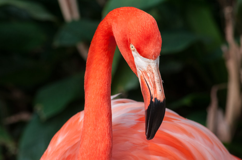
image size: big
Options reference
Every map make-content-modifier() takes in the Sanity flavour, and the ones that only exist for WordPress.
Option maps
| Map | Styles | Keys | In this project |
|---|---|---|---|
$headings-options | Direct h1 to h6 | One font map per level, "h1" to "h6" | h2 to h6 |
$paragraphs-options | Direct p | A font map | className, margin-bottom, bold-font-weight |
$link-options | a without a class | "className" | f--color-e |
$lists-options | ul, ol and their li | first-, second-, third-level-artwork-* (width, top, image, background, border-radius, border-width, border-color), *-level-number-color, first-number-width, number-font, font-styles, margin-bottom, nested-list-spacing | First level, number-font, font-styles, spacing |
$image-options | figure, its img and figcaption | Media keys on the image (border-*, object-fit, object-position, min-/max-width, min-/max-height), margin-bottom, caption (font map) | border-radius, margin-bottom, caption |
$quote-options | blockquote | padding, margin-top, margin-bottom, border (map), paragraph (font map, matches nothing in Sanity) | Spacing and border |
$custom-options | Any selector inside the wrapper | A map of CSS properties per selector; "class" is a list of classes to extend | blockquote, a:not([class]) |
Font map keys
Wherever a map styles text (a heading level, $paragraphs-options, number-font, font-styles, caption) these are the keys it accepts:
| Key | What it does |
|---|---|
className | Foundation classes to extend, space separated |
color, font-family, font-size, font-style, font-weight, letter-spacing, line-height, text-align | Written as-is on the element |
text-decoration, text-decoration-color, text-underline-position | Written as-is on the element |
margin-bottom, padding-top | Spacing above and below |
margin-bottom-before-lists | The bottom margin when the next sibling is a ul or ol |
bold-font-weight | Weight of strong and b inside the element |
max-lines | Clamps the text to that many lines with an ellipsis |
WordPress only
These maps are accepted by make-content-modifier() but throw Sanity doesn't support … styles at compile time with the Sanity import, because Portable Text has no such blocks: $btn-options, $columns-options, $footnote-options, $highlighted-options, $separator-options, $video-options, $table-options and $utilities-options. The "cite" key of $quote-options throws too. Switch the import to @terrahq/wysiwyg/wordpress and they all become available.